A recent idea has been floating around the design world: artists generate, and everyone else personalizes. It sounds simple, yet it quietly changes how digital products get built. Instead of treating visuals like a one-time “final layer,” teams treat them like a flexible kit. The artist establishes the tone, form, lighting, and mood. Then, product people, marketeers, founders, and creators take all of this and apply it to real-world applications: a new feature page, a launch email, a pricing update, a seasonal campaign, a redesign sprint that launched two weeks late.
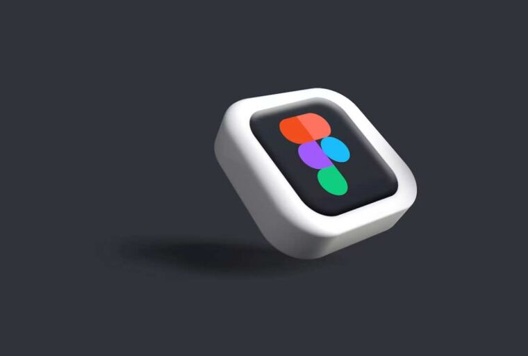
That strategy shows up most clearly in small elements that travel everywhere, like 3d icons. They feel like ornamentation at first impression, but they prove to be the binding agent that keeps a product cohesive on screens of various dimensions. An icon set can link a landing page to an onboarding tutorial, a help article to a dashboard tooltip, or a social media update to a slide deck without anyone mandating a rigid format.
From Generation to Personalization
The old workflow used to be linear. Someone designed a page, then added visuals, then exported assets, then hoped everything still fit when the copy changed. The new workflow looks more like a loop. Visuals get created with variation in mind, and the “final” version stays open for adjustment.
Personalization goes well beyond just changing the color or adding a logo. Personalization might be as simple as adjusting the position of an element so it’s facing the call to action, or it might mean using a more rounded set of icons on the health-related application versus the more sharply angled icons on the financial application. These small edits have a large impact-they really work to close the gap between the experience the application claims to provide versus how it feels.
There is also a practical reason this shift is happening. Most teams publish more than they design. A product team ships UI updates weekly. A marketing team posts daily. A support team maintains a knowledge base that grows every month. A single “hero illustration” can’t carry that workload. A library of adaptable visuals can.
Why Small Visual Choices Matter
People rarely remember the exact headline, yet they remember the sense of clarity or friction. Visual systems shape that feeling.
A good icon system does three jobs at once:
- It speeds up understanding. Users process shapes and metaphors quickly, especially when scanning.
- It sets the emotional temperature. Rounded forms and soft depth can feel friendly. Crisp edges and high contrast can feel efficient and technical.
- It signals care. Consistency hints that someone thought through the experience end to end.
Three-dimensional icon styles add a specific advantage: they introduce depth without demanding complex illustrations for every scenario. A well-made 3D icon can suggest “realness” and “objecthood,” which is useful when explaining abstract features like encryption, automation, cloud sync, or personalization itself.
This is why niche products often benefit the most from strong icon choices. When a topic is unfamiliar, a visual metaphor gives the user a handle. When a feature is complex, a simple object can act like a bookmark in the mind.
Where 3D Icons Earn Their Keep
Three-dimensional icons tend to work best when they support structure, not when they steal attention. They shine in places where the user needs orientation, reassurance, or quick pattern recognition.
Here are some high-impact, under-discussed spots where 3D icons can quietly do heavy lifting:
- Empty states and first-run screens
The first time a dashboard loads and there is “nothing here yet,” a strong icon can make the moment feel intentional instead of unfinished. - Micro-features that rarely get a headline
Settings screens, permissions, import steps, error recovery, and confirmation messages all benefit from visual cues. These moments shape trust. - Help center articles and onboarding checklists
People skim support content. Icons can guide the eye and reduce the feeling of a wall of text. - Feature grouping in complex products
When a product has many tools, icon families create categories without adding extra words. This helps navigation and reduces cognitive load. - Internal docs and stakeholder decks
Teams spend hours aligning on plans. Clear icons help a slide read faster and keep the deck from looking like a spreadsheet with headings.
The niche angle is this: 3D icons are useful even when the product itself is not “fun.” Security tools, B2B admin panels, compliance dashboards, logistics platforms, and data utilities all benefit from visuals that reduce fatigue. The goal is calm clarity, not decoration.
A Practical Workflow for Busy Teams
Personalization works when it fits into real schedules. A visual system that requires constant specialist work becomes a bottleneck. The healthier approach treats visuals like reusable components with clear rules.
A simple workflow can look like this:
- Define a small set of “icon roles”
For example: navigation, feature highlights, empty states, and marketing accents. Each role has a size range and a complexity limit. - Pick a consistent viewpoint and lighting logic
Even if the icons vary, they should feel like they live in the same world. View angle, shadow softness, and material style matter more than people expect. - Create a “safe customization layer”
Decide what can change without breaking the system: background shapes, accent colors, small labels, or tiny props. Keep the main form stable. - Connect icons to copy blocks
Treat icon and headline as a pair. If the headline changes, the icon should still fit the idea. This prevents visuals from becoming mismatched decorations. - Audit the system like a product feature
Every few weeks, check where icons are being used. Look for drift: mixed styles, inconsistent spacing, or icons doing too much storytelling.
This workflow supports the “generate then personalize” strategy because it respects both sides. The artist’s work stays recognizable, and the team still has room to adapt. It also reduces the temptation to chase trends every month. A strong icon system can feel current for years when it is built on clean rules.
Future-proofing the Visual System
Design trends come and go with time. However, the emerging shift is the need for images to be flexible, easily deployable, and similar across many touch points. That expectation will keep growing.
A future-proof visual system has a few traits:
- Modularity
Assets should scale from app UI to marketing without falling apart. That usually means planning for multiple sizes and contexts. - Semantic clarity
An icon should still “read” when the user is tired, distracted, or scanning quickly. Clever metaphors are useful only when they are obvious. - Controlled personality
Brands often want character, and character can be built through a consistent 3D style. The trick is keeping that personality steady even when content changes weekly. - Compatibility with AI-assisted workflows
AI tools can generate variations and speed up ideation. The strongest teams use AI to explore options, then apply human taste to keep the system coherent. This matches the core strategy: generation creates possibilities, personalization makes them usable.
In the end, the most modern creative work often looks quiet. It feels smooth. It avoids forcing attention. It guides users, supports messages, and keeps a brand consistent across dozens of small touchpoints.
That is the real promise of the “artists generate, you personalize” approach. It does not replace craft. It spreads craft across the whole product and content ecosystem, where the user actually experiences it.